Through an invitation by Deutsche Telekom, the Gallery Wall of their flagship store in Berlin Mitte was redesigned. The 4010-store engages with its customers via its own Facebook page, promoting special offers, posting photos of events, pushing discussions and sharing information about new products and gadgets. The variety of individual posts determines the content of the page and reflects their virtual identity. This piece brings the online communication back into the store by creating a beautiful and meaningful data visualization generated from the store’s Facebook posts.

4010 Facebook Tree
data illustration for Telekom flagship store
2013
This abstract data illustration highlights the store’s communication by visualizing the interaction of users online. Inspired by botany, the residue of correspondence is transformed into colourful forms reminiscent of natural vegetation.

By accessing the Facebook Graph-API, an analysis was made of the data recorded over a four-year period using a custom-written application in Processing. The challenge of this project was to illustrate the individual elements and characteristics of a conversation - the number of likes and comments, the type of post, and the time of creation for example - while presenting a sum of all those elements in a single, compelling data illustration representing the stores’ online communication.

the leaves & labels
The metaphor of the visualization was a hybrid of a generative and organic tree representing major topic branches, or themes, and the individual communications related to them. A set of algorithmic rules generated the primary structure and substructures of the visualization. The leaves were generated based on different features of the posts. For each post we analyzed characteristics such as the creation date and time, the number of comments and likes an individual post received, as well as the type of the post and its length. The values were mapped to the features of the leaves enabling the visitors to read and explore the visualization, and get an idea of the nature of the communication. For each type of message, a special leaf style was created. As likes increase the leaf turns red while the message post time defines how much the leaf flourishes. The results produced a very organic effect where messages posted during the evening and early morning yielded closed leaves that slowly opened throughout the day. The accruing number of buds spawning around a leaf indicates the number of comments.
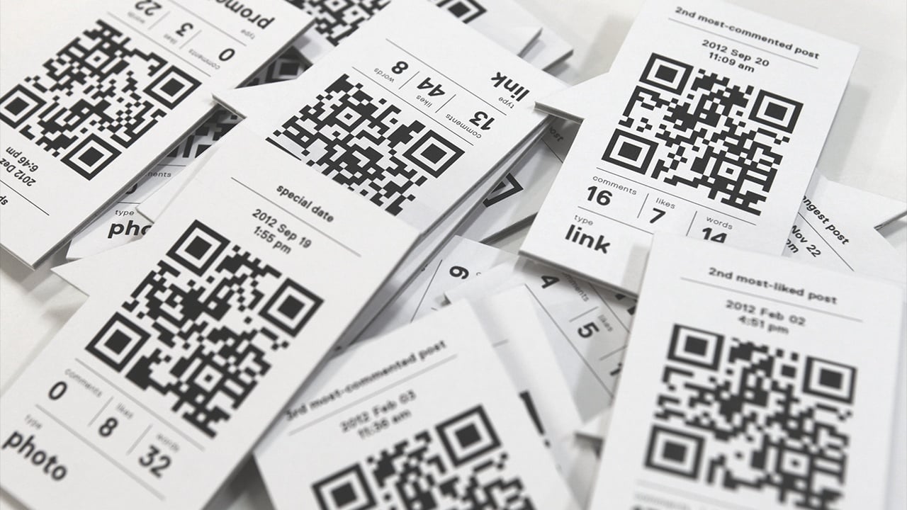
To blur the boundaries between abstract visualization and concrete data, labels highlight important posts such as the most commented or most liked post of a category. In this way the user was able to directly explore the underlying data with their cell phone by scanning a QR code which directly sent the user to the corresponding Facebook post.
application
In nature, trees create beautiful organic compositions while algorithmic solutions often lead to mechanical and predictable structures and symmetry. A flexible design tool was developed to generate variations and permit manual editing to achieve a desired layout and look. The generative leaves were then automatically assigned to the branches depending on their date of creation. With this method, it is possible to ‘read’ the leaves as posts from the top of the tree down to its roots.


credits
- Commissioned by: Die Krieger des Lichts
- Production: Julia Laub
- Creative Direction & Design: Cedric Kiefer
- Code: Christian Loclair, Cedric Kiefer
exhibitions
- Double Data, Typography and Data Visualization, Los Angeles 2016
- Weltformat 16 Poster Festival, Lucerne 2016
- Graphic Design Festival – exhibition Everyda(y)ta, Breda 2015